XP-Style Button

Sample Image - XP-Style_Button.jpg

Introduction

XP-Style Button provides the look and feel of a button with any of of the three built-in color schemes of Windows XP and will also work with earlier versions of Windows, or using a color scheme if you use Windows XP. You simply don't have to worry about how the button will look like on different versions of Windows - it will always look the same.

->Read More...

Custom Bitmap Button Using C#


Sample Image - maximum width is 600 pixels

Introduction

The motivation behind the custom bitmap control was to allow different bitmap images to be displayed for each of the button states. This includes disabled, normal, mouse over, and button pressed. In addition to the button graphics, it was important to include button text and control the alignment of the text with regards to the button image. It follows an XP style look and feel with some embellishments that are unique to it.

CopyRight :http://www.codeproject.com/KB/buttons/XCtrls.aspx

->Read More...

WindowsVistaRenderer: A New Button Generation


Screenshot - VistaRenderer.jpg

Introduction

This article demonstrates how to use the WindowsVistaRenderer and how it was created.

LedButton Status Control

Sample Image->Read More...

HyperButtonEx: An All-in-One Button Class

Screenshots

Introduction

This class introduces HyperButtonEx, an all-in-one button class. It supports bitmap transparency, custom fonts, rounded rectangles, and more! Hyperlink and Shell functionality has been built into the class.

->Read More...

FxButton Class


Second demo button gallery

Introduction

FxButton allows developers to create customized buttons using captions, bitmaps, tooltips, etc. It cannot do everything, so be sure to check its limitations. I'm a beginner in coding VC++ with MFC and I made this class for fun and - above all - to learn.

The aim of this class - but not the only one - is to make it as easy as possible to integrate it in an application and to have the maximum options available. If you don't know what a handle is and you want a bitmap button, you can use this class.

The first FxButton demo is not a button gallery; it contains only one FxButton but you can play with it. The demo gives access to about 30 button components. Each of these options can be applied to any button state: normal, pushed, over or disabled.

The second FxButton demo is a button gallery. It shows the use of clipping regions for buttons and transparent bitmaps applied to push, check or radio buttons.

Copy Right : http://www.codeproject.com/KB/buttons/fxbutton.aspx

->Read More...

RoundButton Windows Control - Ever Decreasing Circles

Round buttons

Introduction

Some time ago, I tried to find a nice round-button control. I couldn't find one, so in the time-honoured tradition, I decided to write my own. I "almost" finished it, but for various reasons, it was consigned to the "come back to it later" category. In its inimitable style, "later" finally arrived, and armed with my shiny new Microsoft Visual C# 2005 Express Edition, I decided to have a crack at finishing it.

Though I say it myself, I think the buttons look nice - you'll have to judge for yourself! They look even better "in the flesh", rather than as the JPEGs in this article.

Background

In my quest for a round button control, I came across a couple of articles (including one by the great man Chris Maunder himself!) which seemed to me and my Very Small Brain to have far too much complicated mathematics involved. Also, I'd been learning about graphics in C#, and doing a lot of experimenting with groovy things like the PathGradientBrush, taking much inspiration from the very excellent Bob Powellsite. Probably, by chance, I forget exactly how, I stumbled upon the idea of layering ever decreasing circles filled withLinearGradientBrushes and PathGradientBrushes one above the other to build up a passable 3-D button. The following images illustrate this:

Hover your cursor for a description

The Button recess onlyThe Button recess with an edgeThe Button recess with an edge and an outer bevel

The Button recess with an edge and both bevelsThe Button recess with an edge, both bevels and a flat topThe Button recess with an edge, both bevels and a domed top

Copy Right http://www.codeproject.com/KB/buttons/RoundButton.aspx

->Read More...

Vista Style Button in C#


Screenshot - Screenshot.jpg

Introduction

I have a habit of using the standard Windows controls as little as possible. If I can write my own control to do it then I will. It's kinda like reinventing the wheel but adding spinners. Anyways this is an article on a Vista Style button that I made. Unlike the progress bar control I wrote, I didn't create it in Photoshop first. I just designed it in code, as a result it's not quite as nice looking as the actual Vista buttons. The actual button itself can be made very un-Vista-ish if you want to by changing the colours but the default look for the button is the one in the top left.

Coppy Right : http://www.codeproject.com/KB/buttons/VistaButton.aspx

->Read More...

SplitButton: an XP style dropdown split button

Demo

Demo

Introduction

Yesterday, I was thinking the best way to solve a particular situation (specific actions derived logically from one) was a split button. Searching and searching on MSDN produced no results, so I was perplexed: no split button in .NET? No, there isn't. The strange thing is that aStripSplitButton (or something like that) exists, that is, the split button equivalent for the ToolStrip. Probably, not being a standard control for the system, they though not to include the control, because it was easy to simulate its functionality with images, and that's what I did.

Using the code

The control is very easy to use. Anyway, this is the step-by-step how-to-do:

  1. Include SplitButton.cs and SplitButton.designer.cs in your project.
  2. Load the assembly in the toolbox of Visual Studio, or just insert a Button control in your form, and then change the type from Buttonto SplitButton.

    [Updated: Oct '06] You can stop here, default images for split states will be used by the control, or you can follow next steps to customize split images.

    Optional:

  3. Add an ImageList to your form (or control or whatever) and set the ImageList property of the SplitButton to this ImageList.
  4. Add images you want to the ImageList for the SplitButton splitter side statuses: Normal, Hover, Clicked, Disabled,Focused.
  5. Now, have a look at the property windows for the SplitButton, go to "Split Button Images" category, and simply select an image for each status from the list box of images (the ones in the ImageList of the SplitButton).
  6. Now, you can set some suggested options: TextAlign to MiddleLeft, ImageAlign to MiddleRight, and TextImageRelationto TextBeforeImage. You're done.

Now you can set some custom options for the SplitButton, a brief description follows:

  • bool DoubleClickedEnabled - Indicates whether the double click event is raised on the SplitButton.
  • bool AlwaysDropDown - Indicates whether the SplitButton always shows the drop down menu even if the button part is clicked.
  • bool AlwaysHoverChange - Indicates whether the SplitButton always shows the hover image status in the split part even if the button part is hovered.
  • bool CalculateSplitRect - Indicates whether the split rectangle must be calculated (based on the split image size).
  • bool FillSplitHeight - Indicates whether the split height must be filled to the button height even if the split image height is lower.
  • int SplitHeight - The split height (ignored if CalculateSplitRect is set to true).
  • int SplitWidth - The split width (ignored if CalculateSplitRect is set to true).

In addition to this, there are two events:

  • ButtonClick - Occurs when the button part of the SplitButton is clicked.
  • ButtonDoubleClick - Occurs when the button part of the SplitButton is double-clicked.

Conclusion

It's only a simple control, I know, but it could be useful in my opinion.

So, that's all, I think. I hope you'll find it useful, bye!

License

This article has no explicit license attached to it but may contain usage terms in the article text or the download files themselves. If in doubt please contact the author via the discussion board below.

A list of licenses authors might use can be found here

About the Author

->Read More...

Bouncing Hover Button


Sample Image

Introduction

This multifunctional button supports two different styles: Standard (standard VB.NET button) and BouncingHover. In theBouncingHover mode, the user can set normal and hover colors for the button's border, backcolor and forecolor as well as location of the text and the image. In this mode, the button's image (if it exists) and text are bouncing when the mouse is entering/leaving or clicking the control, while the disabled button's image and text get a colorless view. This control also supports three different types: Normal, Check andAlternative, that make the button work respectively as a normal Button, CheckBox and RadioButton. The user can also switch on beep and manage its duration and frequency.

Copyright :http://www.codeproject.com/KB/cpp/BouncingHoverButton.aspx

->Read More...

A Simple Wizard Control for .Net 2.0 with Full Designer Support

Download :
WizardDemo_Lib.zip


WizardDemo1.png

Introduction

This control allows the creation of a wizard framework in seconds. All you need to do is drag and drop and your wizard is ready for use. This wizard control has full designer support and is highly customizable according to the needs of the user.

Background

I was trying to find a control similar to the wizard in ASP.NET. I learned that it is not available in the .NET Framework, so I decided to make a framework that would allow me to make a wizard in a few simple steps. The wizard control is easy to use - a beginner user should be able to use this control without any problems. The wizard control provides full designer support to users by allowing them to view current program actions.

Using the Library

Step 1: Add a reference to Wizarddemo.dll. This step will add the control automatically to the toolbox of Visual Studio.

Step 2: Drag and drop WizardControl to the form where you want to implement the wizard.

WizardDemo3.png

Once dragged, a wizard is created for the form.

Step 3: Use the designer to customize the designer.

WizardDemo4.png
WizardDemo6.png
WizardDemo7.png
WizardDemo8.png
WizardDemo9.png
WizardDemo10.png
WizardDemo2.png
WizardDemo5.png

Points of Interest

WizardControl

Properties

  • BackButtonEnabled - Defines whether or not the Back button is enabled or disabled.
  • BackButtonText - This can be used to get or set the text of the Back button.
  • BackButtonVisible - Indicates whether the Back button is visible or not.
  • NextButtonEnabled - Defines if the Next button is enabled or disabled.
  • NextButtonText - This can be used to get or set text of the Next button.
  • NextButtonVisible - Indicates whether the Next button is visible or not.
  • CancelButtonEnabled - Defines whether the Cancel button is enabled or disabled.
  • CancelButtonText - This can be used to get or set the text of the Cancel button.
  • CancelButtonVisible - Indicates whether the Cancel button is visible or not.
  • HelpButtonEnabled - Defines whether the the Help button is enabled or disabled.
  • HelpButtonText - This can be used to get or set the text of the Help button.
  • HelpButtonVisible - Indicates whether the Help button is visible or not.
  • FinishButtonText - Text of Finish button.
  • EulaButtonEnabled - Defines if the Eula label is enabled or disabled.
  • EulaButtonText - This can be used to get or set the text of Eula label.
  • EulaButtonVisible - Indicates whether the Eula label is visible or not.

Events

  • BackButtonClick - The Back button is clicked.
  • CancelButtonClick - The Cancel button is clicked.
  • FinishButtonClick - The Finish button is clicked.
  • HelpButtonClick - The Help button is clicked.
  • NextButtonClick - The Next button is clicked.
  • EulaButtonClick - The Eula button is clicked.
  • CurrentStepIndexChanged - Occurs after a current step index is changed.

StartStep

Properties

  • Title - Title text of the step.
  • TitleAppearence - Title appearance of the step.
  • SubTitle - The subtitle text of the step.
  • SubtitleAppearence - The subtitle appearance of step.
  • LeftPair - The back color appearance of the left panel.
  • BindingImage - Image for the step.
  • Icon - Icon displayed in the start step.
  • LeftPanelBackColor - If image is null, left panel back color.

Events

  • BindingImageChanged - Fires when BindingImageChanged of the step is changed.

LicenseStep

Properties

  • Title - Title text of the step.
  • TitleAppearence - Title appearance of the step.
  • SubTitle - Subtitle text of the step.
  • SubtitleAppearence - Subtitle appearance of step.
  • Warning - Warning text.
  • WarningFont - The warning text appearance of the step.
  • BindingImage - Image for the step.
  • HeaderPair - Appearance of header.
  • Accepted - Status of license agreement.
  • AcceptText - Accept text.
  • DeclineText - Accept text.
  • LicenseFile - License file to display.

Events

  • BindingImageChanged - Fires when BindingImageChanged of the step is changed.
  • AgreementChanged - Fires when license agreement of the step is changed.

IntermediateStep

Properties

  • Title - Title text of the step.
  • TitleAppearence - The title text appearance of the step.
  • SubTitle - Subtitle text of the step.
  • SubtitleAppearence - The subtitle appearance of the step.
  • HeaderPair - Appearance of the header.
  • BindingImage - Image for the step.

Events

  • BindingImageChanged - Fires when BindingImageChanged of the step is changed.

FinishStep

Properties

  • BindingImage - Background of the finish step.
  • Pair - Appearance of the body.

Events

  • BindingImageChanged - Fires when BindingImageChanged of the step is changed.

Known Issues

  • During the removal of the wizard control, the step code is not removed from the designer.

History

This is the first release of the wizard. Suggestions are welcome for improving this framework.

First revision: 02/2008

  • Generic designer integrated.
  • Advanced generic collections used.
  • Advanced generic type converters.
  • Very small in size.
  • Serialization support.
  • Reset support.
  • Shadow text support.
  • During the removal of the wizard control, the step code is not removed from the designer: fixed.
  • Problem with binding image fixed; it was not setting to null.
  • New events added.
  • License agreement step added.
  • Finish page updated.
  • Other small issues fixed.

License

This article, along with any associated source code and files, is licensed under The Code Project Open License (CPOL)

Copyright : http://www.codeproject.com/KB/cs/WizardDemo.aspx

->Read More...

A Demonstration for WPF Ribbon Control Library

Introduction

This article serves as a practical demonstration of the Ribbon Control and associated Office UI Guideline components as presented in the article shown here (a WPF C# Ribbon Control Library). Read this article before using this code.

This article does not present an overview or otherwise of how to use the library but presents only a specific demonstration application and points of interest when using the library; for fuller information on the library, please see the main article linked above.

The article presents a demonstration application using version 1.0.0.10 of the library.

Coppy Right : http://www.codeproject.com/KB/WPF/ribbondemo.aspx

->Read More...

WPF C# Ribbon Control Library

See introduction for inportant information BEFORE downloading any files.

ribboncontrol11.jpg

ribboncontrol21.jpg

ribboncontrol18.jpg

Introduction

IMPORTANT INFORMATION: This code and example this article describes is now BETA stage code, and as such may be below commercial or otherwise quality standards. It is recommended this code is not used for projects of short deadline, and that code modifications are kept to a minimum to reduce later work when the included source and binaries are updated. Please only use this code for minor projects currently, and check back for soon to come updates. This code DOES WORK however does not have all functionality added yet, such as some event handlers and other 'expected' features. Feel free to contact myself via email or otherwise for bug reports and feature requests. Thank you.

This article presents a library for producing Microsoft Office 2007 style ribbon interfaces; while the included source and binaries are in BETA release, it should be possible to implement even the most complex of ribbon style interfaces (albeit with minor alterations). Currently the library does not support creation of ribbon controls via WPF XAML code, however requires the creation of the ribbon bar via C# code behind.

IMPORTANT INFORMATION: To use this code you must agree to the licensing agreement and guidelines as set out by Microsoft. While the Office UI Guidelines are not currently legally required as the library owner and creator I am enforcing compilence with the guidelines, YOU MUST CONFORM. Part of these guidlines includes the requirement that you MUST have other components which are currently NOT part of this library; I in no way imply or otherwise that this library is sufficient for quilification for the Microsoft Office UI license. Ensuring you have these other components is YOUR responsibility. By downloading the source code or by using the source code you have agreed to follow download and follow the Microsoft required guidelines.

Please note that many of the screen shots are rather old, I will endevour to update them at some stage however try the demo as that will give you the latest look and feel. Please note they will be updated for version 1.0.0.11 of the library.

Cpoyright : http://www.codeproject.com/KB/WPF/ribboncontrol.aspx

->Read More...

An Outlook Bar Implementation

Download :


Coppy Right :http://www.codeproject.com/KB/selection/csoutlookbar.aspx->Read More...

Navigation Sidebar

Introduction

Recently, a client requested an Outlook 2003 style navigation bar for his WTL project. Not finding a suitable control on CodeProject in WTL, I decided to create one. I hope you find this control useful for your own projects; appropriate attribution of credit would be appreciated.

An Outlook 2003 navigation bar is equivalent to a tabbed window system that changes two views at once. It can accommodate any number of "tabs", although it works best with a relatively mediocre amount.

This project requires:

  • WTL 7.5 or later.
  • atlgdix.h from www.viksoe.dk.
  • GDI+ from Microsoft.
->Read More...

Cheat's Outlook Bar

Download :

Sample Image - CheatsOutlookBar.jpg

Introduction

I believe there's an old saying, "Clothes maketh the man", and this definitely applies to software too. No matter how clever and hard-working your applications are, if they're not wearing the latest well-designed clothes, people will think they are poorly written and out of date.

While working on a new project recently, I did a quick search on the web to see what the competition was up to. One of the features they had, which I didn't, was an Outlook-style menu bar, commonly referred to simply as an Outlook Bar. Deciding I wanted one too, I thought about writing my own. Searching the Code Project, I found two useful articles, Marc Clifton's An Outlook Bar Implementation, and Outlook XP bar by ACorbs. Both these articles were interesting and thought-provoking, and I downloaded each of them for a bit of a poke around, as one does!

I then found myself in a bit of a dilemma. I didn't want to simply copy someone else's code, but at the same time, I didn't want to spend hours and hours reinventing the wheel. I remembered a comment made by my manager at a previous job, many years ago. "What are we trying to do here? Achieve technical excellence, or get a job done?" Realising that Marc and ACorbs had done the former, I decided to go for the latter approach, and started doing some lateral thinking.

Coppy Right :http://www.codeproject.com/KB/menus/CheatsOutlookBar.aspx

->Read More...

Creating an outlook like side bar using the smart client software factory

Download :

smartclientoutlookbar_src.zip

(2) smartclientoutlookbar_demo.zip

Sample Image - smartclientoutlookbar.jpg

Contents

Introduction
Example Application
Installing SCSF and its prerequisites
Installing Outlookbarworkspace
Viewing an outlook like side bar in a sample application
Create New Smart Client Solution
Modify the solution to add OutlookBarWorkspace
Adding items to outlookbarworkspace and their corresponding views in the left and right.
; Adding Business Module to Smart Client Solution
; Implementing the User Interface-Add a new view (with presenter)
Add code to display item in outlookbarworkspace
Add code to handle click of outlookbarworkspace.
Communication between left and right Views
Summary

Introduction

I have been reading codeproject for some time and have been using the codes provided. I saw that there were quite a few articles on outlook side bar. Then while searching for the same in google I found Matias Woloski’s blog and his creation (a Composite UI Application Block(CAB) workspace) outlookbarworkspace which created a beautiful outlook like side bar. Then I went on to study Microsoft Smart client software factory and decided to use both these in my next project. A few days back I decided to write an article on whatever I learnt in the process and basically using the smart client software factory to get an outlook bar.

As this is my first article I will be very anxious to know if you found it to be useful. So please do provide feedback. Copyright : http://www.codeproject.com/KB/smart/smartclientoutlookbar.aspx->Read More...

Microsoft Office 2007 Style Control

Quick Access Toolbar - 'Add to' menu

Quick Access Toolbar - Menu

Quick Access Toolbar - Customize

Introduction

This article introduces the Quick Access Toolbar (QAT, pronounced c-a-t) as part of the larger project, a WPF C# Ribbon Control Library. The QAT is a required component as stipulated by the Microsoft Office User Interface (UI) Guidelines. The QAT provides document wide commands always at a single click, regardless of the current ribbon or otherwise.

IMPORTANT INFORMATION: To use this code you must agree to the licensing agreement and guidelines as set out by Microsoft. Part of these guidelines includes the requirement that you MUST have other components which are currently NOT part of this library; I in no way imply or otherwise that this library is sufficient for qualification for the Microsoft Office UI license. Ensuring you have these other components is YOUR responsibility. By downloading the source code or by using the source code you have agreed to follow download and follow the Microsoft required guidelines.

Copyright http://www.codeproject.com/KB/WPF/qat.aspx

->Read More...

XP Button Style in VB.NET

Download :

Introduction

I was surprised to find that Visual Studio 2003 .NET, the latest and greatest Windows application development tool, doesn't include an easy way to create XP-style buttons. Then I noticed that Office XP mostly uses the old-fashioned 3D buttons, suggesting that implementing the new style is not trivial. The new buttons are mostly found in Windows XP accessories and Internet Explorer 6. As a programmer, my first reaction was to jump in and reinvent the wheel, which reminds me that I need to start waiting for my second reaction before I waste any more time.

This article describes a way to create XP-like buttons by implementing the button's Paint method. It's an (interesting, I hope) exploration of GDI+ graphics. But you don't have to go to all this trouble, nor do you have to accept less than perfect results, to achieve XP buttons. You simply need to link your Windows Form application with the latest version (6.0) of ComCtl32.

Copyright:http://www.codeproject.com/KB/cpp/XPStyleB.aspx

->Read More...

Office 2007 Button

Introduction

The Office2007 style button is very easy to use. Only DragDrop ToolBox.

Copyright :http://www.codeproject.com/KB/office/Office_2007_Button.aspx

->Read More...

A multi-purpose XP Office 2003 Style hover and flat button with container bar

Sample Image - lybralibrary592x444.jpg

Introduction

This control (HoverGradientButton) is very easy to use; graphic and chromatic interface results have a great impact. The original idea is from a good article by Victor Boba (thanks Victor!). HoverGradientButton has a lot of properties, but default properties let the programmer to have a full ready-to-use interface with Office 2003 style. The component supports three different styles: HoverNormal, HoverCheck andHoverOption, that make the HoverGradientButton work respectively as normal Button, CheckBox, and RadioButton. The core component HoverGradientButton is shipped with a versatile container (HoverButtonBand) with an additional AutoArrange property.

Furthermore, the library contains GradientPanelXP, a specialized component, inherited from Panel, with some additional features such as Gradient.

CopyRight : http://www.codeproject.com/KB/cpp/lybralibrary.aspx

->Read More...

OutlookBar: A Simplified Outlook Style Sidebar Control

Sample Image - OutlookbarApp1.png

Introduction

I'm currently working on a personal project in which I want to build a small application with an Outlook 2003 style of navigation. This includes the Outlook sidebar containing the colorful buttons. I have been looking for this control here on CodeProject, so far I could only find one written in C++ with WTL.

I decided to write my own Outlook sidebar usercontrol in and for C# (2.0) so it can be easily extended and custimized to the developer's need. This project therefore contains all the sources which may be modified by any means and for any purpose.

Note that the usercontrol does not contain any 2.0 runtime specific code so it should be fairly easy to port it back to 1.1 projects if needed.

CoppyRight : http://www.codeproject.com/KB/menus/OutlookBar.aspx

->Read More...

PallaControls for Windows forms

Introduction

I program in Delphi since the version 1.0, and in this time, I did create some controls that has given form to how I develop my "programs". They help enough in typical tasks of Windows forms applications (Example: validation). Besides, together with some friends of the university of São Paulo, I developed a pattern of "very private visual" identity (combination of colors, sources and forms).

When I began "to play" with the .NET platform, the first thing that I thought was: " I have to do something similar here". This article is exactly a collection of controls that I developed to use in my Windows forms applications. There are approximately 35 controls!

The .NET community all over the world

Sincerely, if the community formed around the .NET platform didn't exist, I would not know where to begin. Actually, a lot of code was just adapted to do part of this collection. In the section of credits, I mention all developers (that I rememeber ; -)) of whom I took advantage of some thing. To publish this library is the form that I have to thank and to return to the community what I could learn.

Controls

The inspiration, kept the due proportion, it is Money of Microsoft. There is a lot to talk about the controls and the intention.

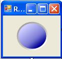
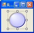
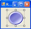
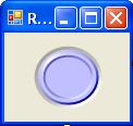
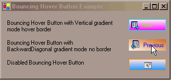
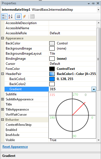
  • StyleGuide – This control serves as base for the style of most of the other ones. The property PlansOfColors contains the existent patterns.
  • Button – A normal button if not for the property Radius (to round the corners).
  • ImageButton – Another normal button; allows the choice of an image.
  • CheckBoxCheckBox reminds a little of that vineyard in a Borland library that came with Borland C.
  • RadioButton – normal radio button.
  • TextBox – Normal textbox with some interesting properties for validation of the entrance of data:
    • Mask- it presents the validation possibilities; some especially useful to Brazil... (17options).
    • NotAcceptChars - together with Mask.TextWithNotAcceptChars it doesn't allow the entrance of disabled characters.
    • DecimalPlaces
    • DecMaxValue
    • DecMinValue

      The last three are for validation and formation of numbers.

    • Required - the completion of the field is indicated, it is of obligatory completion.
    • ShowErrorProvider - the control is indicated it should exhibit the mistake indication.

    input sample

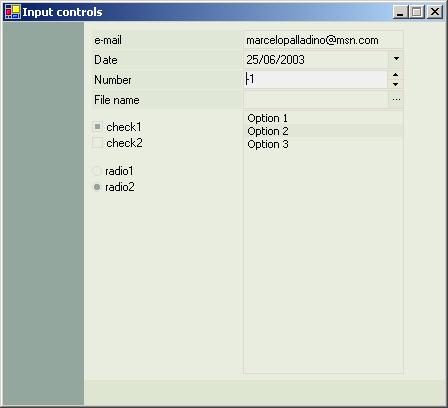
  • ButtonEdit – Textbox with button on the right side that contains the same properties of TextBox.
  • DatePicker - Component for entrance of dates.
  • ComboBox – Normal combobox if not for the following properties:
    • JustAcceptItems- it only accepts the completion with items of the combo.
    • Mask, Required, ShowErrorProvider - Same as TextBox.
    • AutoFill - it fills out the list with pré-defined items (months, states and etc...) Obs: I am almost sorry for having placed this in the control. Its escapes a lot from the defined patterns for the bind mechanism...
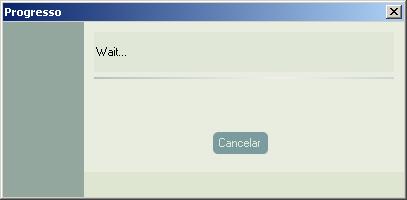
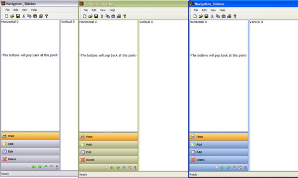
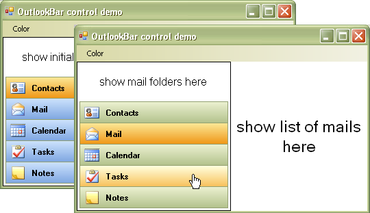
  • GroupBoxPanel, with borders in the extremities, title and possibility of rounding of the corners.
  • MenuListBox – Inspired list box in Money99 that allows shortcut keys, description of the items and definition of an image for the items.
  • InfiniteProgress - infinite progress with gradient effects (pretty good).
  • MessageBox – Component that "imitates" MessageBox contained in System.Windows.Forms. The good thing here is the possibility to use a CheckBox together with the message.

    MessageBox sample

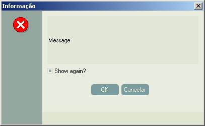
  • DateTimeVisualize – Control "idiot" that I needed for a very private occasion.
  • Label – Normal label if not for the fact of working with StyleGuide.
  • ListBox – Normal list box if not for the fact of working with StyleGuide.
  • OptionButton – Button that works like a RadioButton.
  • SpinEdit – Control for entrance of numbers.
  • XpLine – Line with gradient effects. It "imitates" the lines used in some parts of Windows XP.

    input sample

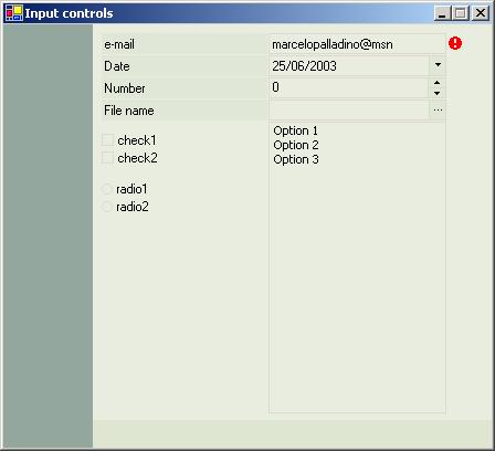
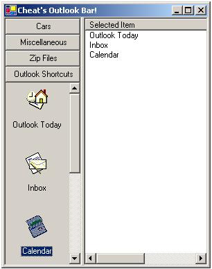
  • TaskPanelBar – A control that allows the creation of windows in the style of Money99, also...
  • TabbedGroups econtroles “Docking” – Save some adaptations, works exactly as in the library "MagicLibrary of Crownwood Consulting Limited". In fact, what I learned with this library, it was worth books that I bought more than some...; -)
  • Panel – A normal panel, if not for the following properties:
    • PanelType - It says to the control, like him it should be "colored", following the established patterns.

    Message sample

Possible memory leaks

In general, as I have been evidencing in some tests (basically it is true) there are not problems with memory leaks. However,MessageBox.ShowProgressDialog seems, that is draining some thing. My suggestion, in case you want to use this: Test before!!

Bindable controls

Independent in the way like me, I did (I think can quite still get better, nannies that you see the listbox to understand it that phallus), most of the controls work well the bind mechanism.

Credits and gratefulness

As I said before, a lot of things were removed off the community; Here I will mention those that I remember:

  • “MagicLibrary" - "CrownwoodConsulting Limited" (this collection of controls is spectacular and the code is a class on how to write controls for Windows forms)
  • “FlatControls" - "Ivar Lumi" (the first light...; -))
  • "Marcelo Soares" - for the creation of the style "AssGreen" and several critics and suggestions to the library. (Man, sometimes almost hill of rage in our discussions, but I have to recognize, your critics strengthen me and you are very competent).
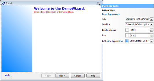
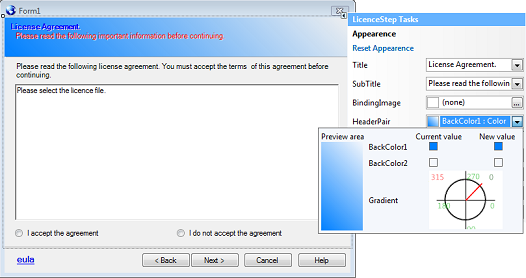
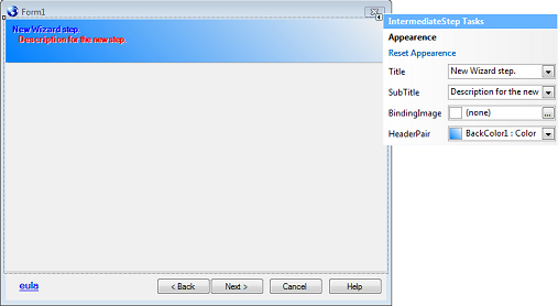
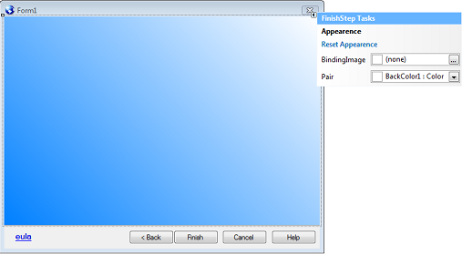
  • "James T. Johnson" –"TSWizard"
  • “Clovett" - "InfiniteProgress"
  • "Ingo Rammer" –“RemotingHelpers"

I think that is it! I might have forgotten somebody, after all, there are nights after nights in the google, reading posts, articles, lowering sources, testing and etc. In case you see something in this library that seems it was adapted and don't have the due credit, please send me an e-mail so that the mistake can be corrected.

Thanks also to MSDN Brazil's personnel; a community truly strong and disposed to help, whenever necessary. A hug for the personnel ofwww.desenvolvendo.net, especially to Fábio Galuppo and Rogério Wagner. You don't know the importance about having people like you so "accessible" and always disposed to help. Congratulations for your work!

A special hug for a teacher whom I had more than ten years, "Nilson Nihomatsu" from "Paralelo school". Among other things, he taught me something that I maintained during this whole time: TO LIKE LEARNING!

Finally, if you improve any part of these controls or wants to discuss something related to the sources, feel free to contact me by e-mail.

History

  • Version 1.0 - 07/27/03
    • Initial version
  • Version 1.1 - 07/30/03
    • Corrections
      • RadioButton - Generation of event CheckedChanged. (thanks Stray Bullet)
      • MessageBox (Show method) - Coordinates of the buttons (YesNo, OKCancel)
      • ComboBox - Added property SelectedValue and event SelectedValueChanged. (thanks toticow)
      • GroupBox - Code of the interface IFlashabledControl
    • Improvements
      • ControlBase, PanelBase - Creation and code of the interface IHasStyleControl to facilitate the configuration of style in child controls.
      • Translation of constants' names in the class ResourceLibrary. (thanks Olaf Herrmann, next step is translate the messages)
  • Version 1.2 - 07/31/03
    • Corrections
      • TextBox - Bug with DecimalPlaces property. (thanks Stray Bullet)
      • DatePicker - LostFocus and PopupWindow bug (null ref...). (thanks Piotr Ozaist)
      • InfiniteProgress - Code of the interface IHasStyleControl.
    • Improvements
      • SpinEdit - "Hold the mouse over the arrow button with pressed key does not continue counting" (thanks Olaf Herrmann)
  • Version 1.3 - 08/05/03
    • Corrections
      • TextBox, DatePicker, ButtonEdit, ComboBox, ListBox, MenuListBox - Use DisableColor when the Enabledproperty is same, the false in designer. (thanks Stray Bullet)
      • GroupBox - Fittings in the drawing of the title. (thanks Stray Bullet)
    • Improvements
      • PallaControls.Resources - (at last!) translation of the messages for English (culture "en"). Still lacks other aspects of individual cultures. (Example: validation of the social insurance number and etc.)
  • Version 1.4 - 08/07/03
    • Corrections
      • Button, CheckBox, RadioButton, GroupBox, OptionButton - Correction of the problem that inverted the colors of the border (BorderHotColor, BorderColor). (thanks JeffGreen)
      • TextBox, DatePicker, ButtonEdit, ComboBox, ListBox, MenuListBox - KeyUp, KeyDown and KeyPress events. (thanks JeffGreen)
      • TextBoxBase - DecMinVal and DecMaxVal bug. (thanks Geri Wolters)
    • Improvements
      • TextBoxBase, Date and Time handlers and validations - "Made it more culture aware and let validation be handled by theDateTime class". (thanks Geri Wolters)
  • Version 1.5 - 08/10/03
    • Improvements
      • TextBoxBase, TextBox, ButtonEdit - Added for Geri Wolters. Custom validation with RegularExpression.
      • StyleGuide - Added for Geri Wolters. Capacity to save and load styles in XML files.
      • StyleGuide - Added style "TweakGreen" created by Stray Bullet.
  • Version 1.6 - 08/23/03
    • Corrections
      • "When adding an Object to the ListBox (Text and Value), I can't get the text to display. I think this is a bug as the MS control worked fine with my code". (thanks JeffGreen)
    • Improvements
      • TextBoxBase, TextBox, ButtonEdit - Added for Geri Wolters. Custom error messages.
  • Version 1.7 - 08/25/03
    • Corrections
      • ControlBase, TextBox, ButtonEdit - GotFocus and LostFocus bugs. (thanks Hzi)

License

This article has no explicit license attached to it but may contain usage terms in the article text or the download files themselves. If in doubt please contact the author via the discussion board below.

A list of licenses authors might use can be found here

Copyright :http://www.codeproject.com/KB/miscctrl/PallaControls.aspx

->Read More...